Composition and Sizing
Here are some basic composition, size and spacing specification of the logo.
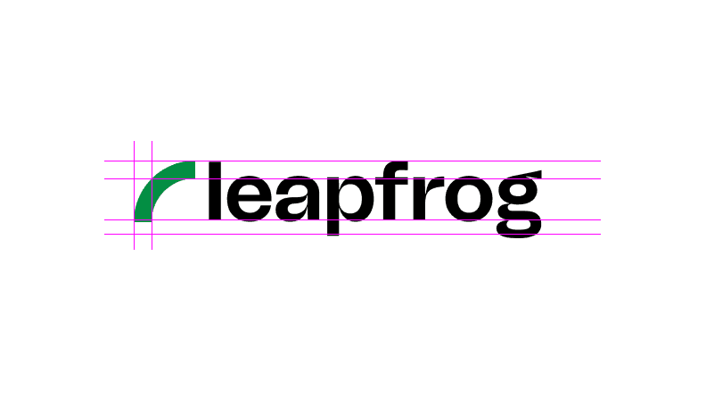
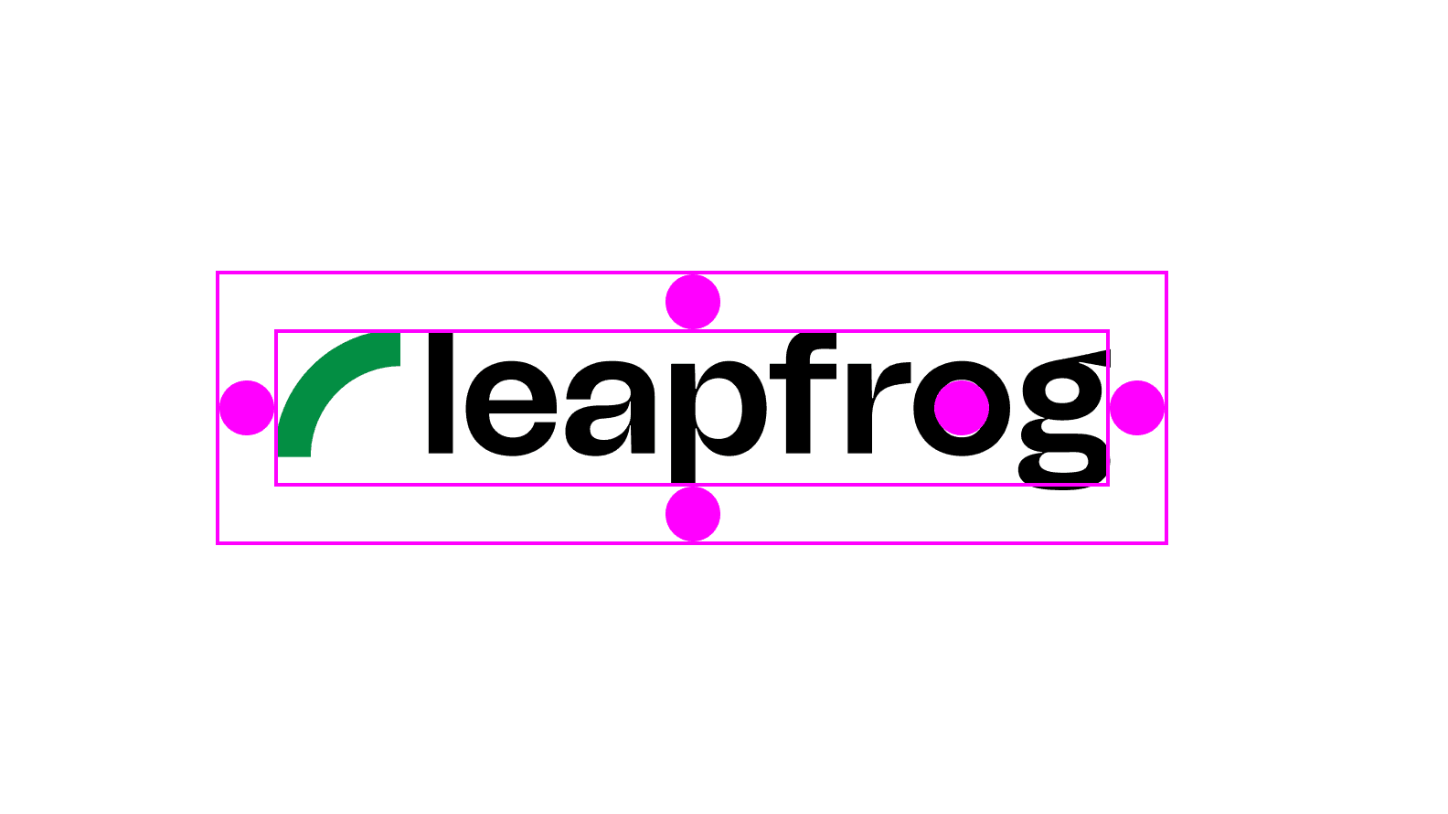
Logo composition
The Leapfrog logo is composed of a onwards and upwards facing swoosh and the word Leapfrog placed besides it on the right. This lockup is the official logo of the Leapfrog brand.
However, we can use the swoosh independently without the word-mark. But remember, the word-mark cannot be used without the swoosh.
Onwards and upwards leap
Balance is the key
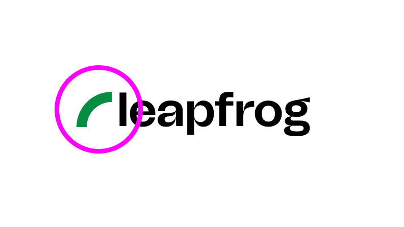
Logo spacing
We want to make sure that the logo is not disturbed or distracted by elements being placed too close to the logo. For this reason, an imaginary circle equal to the size of the inner space of the letter O is used as a reference to create a clear space around the logo.
You must not bring anything too close to the outer perimeter or it will immediately catch fire and disintegrate.
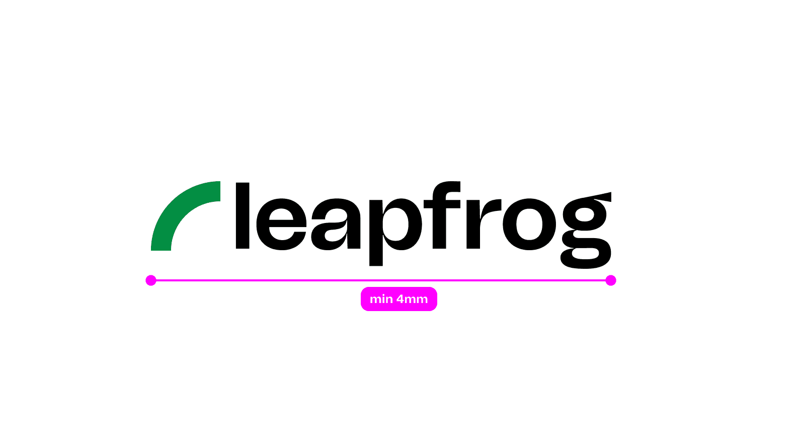
Logo sizing
The logo cannot be resized smaller than the recommended size. A very small logo becomes hard to read and letters will start squishing together. Again, we are a company for innovators and dreamers - not ants.
That is why a minimum of 4mm horizontal size of the logo has been prescribed. If you need to use the logo smaller than this size, please use the favicon instead.