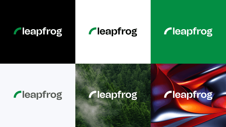
Logo Dos and Donts
We don't ask for a lot. There are just simple dos and donts we have outlined here that will ensure our logo has maximum impact.

Prohibited Uses
Please refrain from using the logo as depicted in the examples below, even in the most extreme circumstances.

Do not use the swoosh bigger than the wordmark
The heigh of the swoosh always equals to the height of the wordmark
Do not place the swoosh on the right hand side of the wordmark
The swoosh is always placed on the left hand side since our logo denotes a direction and must not be changed
Do not stretch or shrink the logo
Refer to the sizing guide for acceptable sizes
Do not change the font of the logo
The logo is always displayed in Tomato Grotesk font
Do not change the color of the swoosh
Except for black, gray and white colors
Do not rotate the logo in any direction
The logo is always horizontal and sits on a surface